
背景图像可能是我们所有前端开发人员在我们的职业生涯中至少使用过几次的CSS属性之一。大多数人认为背景图像不可能有任何不寻常的地方,但经过研究,答案并非如此。所以本文收集了七个我认为最有用的技巧,并创建了一些代码示例。
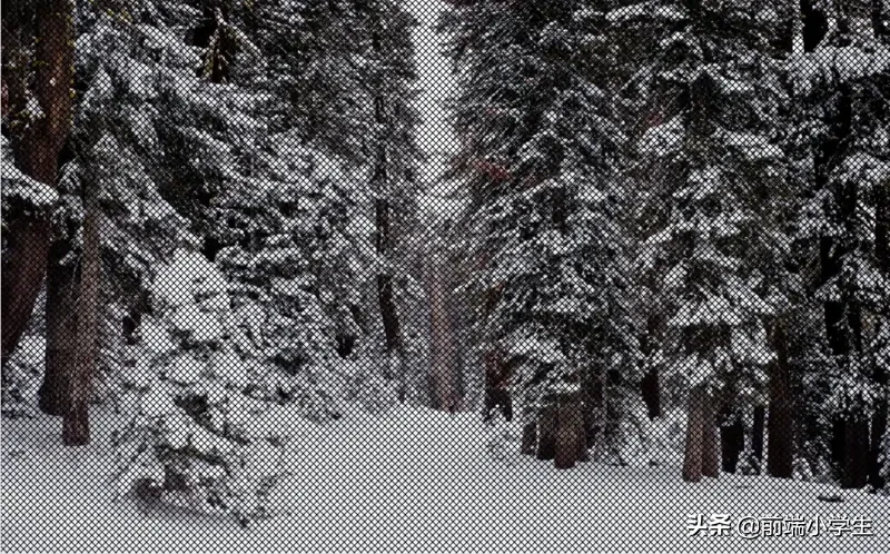
1.背景图如何才能完美适配视口
让背景图适配视口很容易,需要使用下面 CSS 即可:
body {
  background-image: url('https://images.unsplash.com/photo-1573480813647-552e9b7b5394?ixlib=rb-1.2.1&ixid=eyJhcHBfaWQiOjEyMDd9&auto=format&fit=crop&w=2253&q=80');
  background-repeat: no-repeat;
  background-position: center;
  background-attachment: fixed;
  background-size: cover;
  -webkit-background-size: cover;
  -moz-background-size: cover;
  -o-background-size: cover;
}

2.如何在CSS中使用多个背景图片?
如果我想在背景中添加一张以上的图片怎么办?CSS3 中可以直接 指定多个背景路径,如下所示:
body {
  background-image: url(https://image.flaticon.com/icons/svg/748/748122.svg), url(https://images.unsplash.com/photo-1478719059408-592965723cbc?ixlib=rb-1.2.1&auto=format&fit=crop&w=2212&q=80);
  background-position: center, top;
  background-repeat: repeat, no-repeat;
  background-size: contain, cover;
}
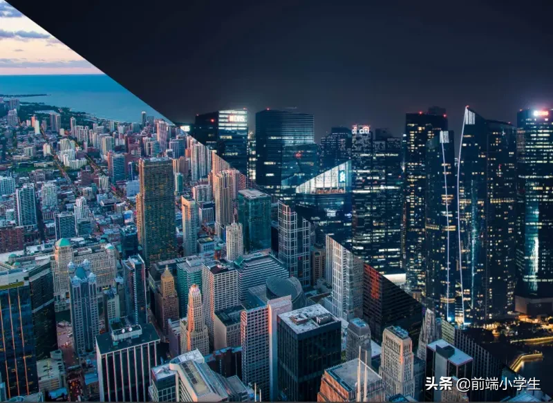
3.如何创建一个三角形的背景图像
另一个很酷的背景特效就是三角形背景,当我们想展示某些完全不同的选择(例如白天和黑夜或冬天和夏天)时,这种特效就更加棒。
思路是这样的,首先创建两个div,然后将两个背景都添加到其中,然后,第二个div使用clip-path属性画出三角形。
<body>
  <div class="day"></div>
  <div class="night"></div>
</body>
body {
margin: 0;
padding: 0;
}
div {
position: absolute;
height: 100vh;
width: 100vw;
}
.day {
background-image: url("images.unsplash.com/photo-14779…");
background-size: cover;
background-repeat: no-repeat;
}
.night {
background-image: url("images.unsplash.com/photo-14935…");
background-size: cover;
background-repeat: no-repeat;
clip-path: polygon(100vw 0, 0% 0vh, 100vw 100vh);
}4.如何在背景图像上添加叠加渐变?
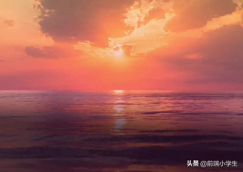
有时我们想在背景上添加一些文字,但有的图片太亮,导致字看不清楚,所以这里我们就需要让背景图叠加一些暗乐来突出文字效果。
例如,可以通过添加粉红橙色渐变或红色至透明渐变来增强日落图像,这些情况下使用叠加的渐变就很容易做到。
body {
  background-image:
    linear-gradient(4deg, rgba(38,8,31,0.75) 30%, rgba(213,49,127,0.3) 45%, rgba(232,120,12,0.3) 100%),
    url("https://images.unsplash.com/photo-1503803548695-c2a7b4a5b875?ixlib=rb-1.2.1&auto=format&fit=crop&w=2250&q=80");
  background-size: cover;
  background-repeat: no-repeat;
  background-attachment: fixed;
  background-position: center
}
5.如何创建一个颜色动态变化的背景
如果你很多颜色,你想确认哪种颜色更适合背景图片的颜色,刚动态更改背景颜色的技巧就很有用。
@keyframes background-overlay-animation {
  0%   {
      background-image:
        linear-gradient(4deg, rgba(255,78,36,0.3) 50%, rgba(255,78,36,0.3) 100%), url("https://images.unsplash.com/photo-1559310589-2673bfe16970?ixlib=rb-1.2.1&ixid=eyJhcHBfaWQiOjEyMDd9&auto=format&fit=crop&w=2250&q=80");
  }
  25%  {
      background-image:
         linear-gradient(4deg, rgba(213,49,127,0.3) 50%, rgba(213,49,127,0.3) 100%), url("https://images.unsplash.com/photo-1559310589-2673bfe16970?ixlib=rb-1.2.1&ixid=eyJhcHBfaWQiOjEyMDd9&auto=format&fit=crop&w=2250&q=80");
  }
  50%  {
    background-image:
       linear-gradient(4deg, rgba(36,182,255,0.3) 50%, rgba(36,182,255,1) 100%),
     url("https://images.unsplash.com/photo-1559310589-2673bfe16970?ixlib=rb-1.2.1&ixid=eyJhcHBfaWQiOjEyMDd9&auto=format&fit=crop&w=2250&q=80");
  }
  100% {
    background-image:
        linear-gradient(4deg, rgba(0,255,254,0.3) 50%, rgba(0,255,254,0.3) 100%),
        url("https://images.unsplash.com/photo-1559310589-2673bfe16970?ixlib=rb-1.2.1&ixid=eyJhcHBfaWQiOjEyMDd9&auto=format&fit=crop&w=2250&q=80");
  }
}
@-webkit-keyframes background-overlay-animation {
0%   {
background-image:
linear-gradient(4deg, rgba(255,78,36,0.3) 50%, rgba(255,78,36,0.3) 100%)
url("images.unsplash.com/photo-15593…");
}
25%  {
background-image:
linear-gradient(4deg, rgba(213,49,127,0.3) 50%, rgba(213,49,127,0.3) 100%),
url("images.unsplash.com/photo-15593…");
}
50%  {
background-image:
linear-gradient(4deg, rgba(36,182,255,0.3) 50%, rgba(36,182,255,1) 100%),
url("images.unsplash.com/photo-15593…");
}
100% {
background-image:
linear-gradient(4deg, rgba(0,255,254,0.3) 50%, rgba(0,255,254,0.3) 100%),
6. 如何制作网格背景图像?
有时候会遇到一些需要有艺术或者摄影类的项目,他们一般要求网站要有艺术信息,要有创意。网络的背景就挺有创意的,效果如下:
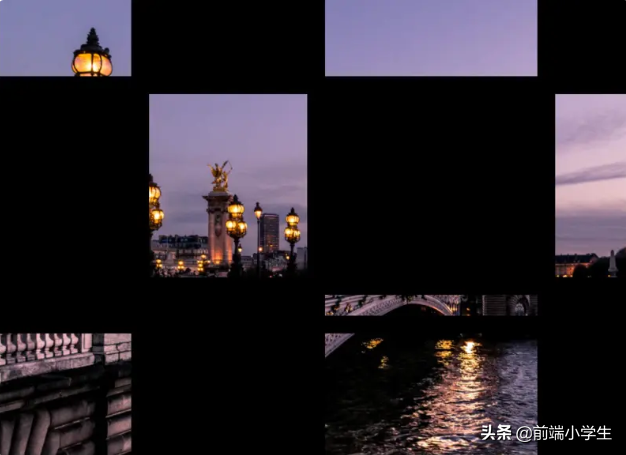
body {
 margin: 0;
  padding: 0;
}
.container {
position: absolute;
width: 100%;
height: 100%;
background: black;
display: grid;
grid-template-columns: 25fr 30fr 40fr 15fr;
grid-template-rows: 20fr 45fr 5fr 30fr;
grid-gap: 20px;
.item_img {
background-image: url('images.unsplash.com/photo-14998…');
background-repeat: no-repeat;
background-position: center;
background-attachment: fixed;
background-size: cover;
}
}
body {
margin: 0;
padding: 0;
}
.container {
position: absolute;
width: 100%;
height: 100%;
background: black;
display: grid;
grid-template-columns: 25fr 30fr 40fr 15fr;
grid-template-rows: 20fr 45fr 5fr 30fr;
grid-gap: 20px;
.item_img {
background-image: url('images.unsplash.com/photo-14998…');
background-repeat: no-repeat;
background-position: center;
background-attachment: fixed;
background-size: cover;
}
}7.如何将背景图像设置为文本颜色?
使用background-image与background-clip,可以实现背景图像对文字的优美效果。 在某些情况下,它可能非常有用,尤其是当我们想创建一个较大的文本标题而又不如普通颜色那么枯燥的情况。
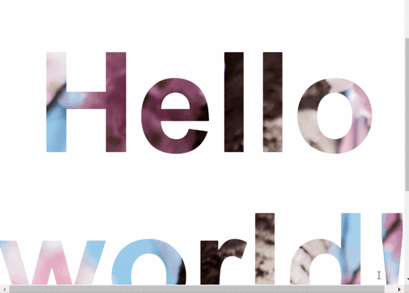
<body>
  <h1>Hello world!</h1>
</body>
body {
display: flex;
align-items: center;
justify-content: center;
flex-direction: column;
width: 100%;
text-align: center;
min-height: 100vh;
font-size: 120px;
font-family:Arial, Helvetica, sans-serif;
}
h1 {
background-image: url("images.unsplash.com/photo-14622…");
background-clip: text;
-webkit-background-clip: text;
color: transparent;
}
相关推荐
-
html如何插入视频(html添加视频的代码的方法)
在网页中常见的多媒体文件包括音频文件和视频文件,对于在线音频和视频,我们往往都是使用embed标签来插入。embed语法: 1 <embed src=””视频地址…
-
css文本不换行加省略号(教你css设置文字不换行显示)
本文说的white-space是一个控制换行和空白处理的CSS属性。我曾经被这个属性烦死,一直没记住,今天决定还是写下来好好琢磨下。 属性值 normal 默认值,正常换行,空白和…
-
自己如何建立一个网站(最简单的HTML建站的代码和建站方法)
无论是个人还是企业,如果没有接触过建站的话,一般都很想知道如何从零开始搭建自己的网站,都有哪些步骤?每一步需要做什么?网站是怎么做出来和上线的? 企业建站的基础3元素,分别是域名,…
-
html快速入门教程(html零基础入门知识)
CSS样式是表现。就像网页的外衣。比如,标题字体、颜色变化,或为标题加入背景图片、边框等。所有这些用来改变内容外观的东西称之为表现。JavaScript是用来实现网页上的特效效果。…
-
什么是css样式及作用(css特效样式知识解析)
上几节我们把HTML相关的必要知识点给大家已经讲完,剩下的细节大家可以查阅资料再进行深入研究。从这一节开始,我们正式进入CSS的学习,在学习之前我们先介绍几个概念。 第一,什么是C…
版权声明:本文内容由互联网用户自发贡献,该文观点仅代表作者本人。本站仅提供信息存储空间服务,不拥有所有权,不承担相关法律责任。如发现本站有涉嫌抄袭侵权/违法违规的内容, 请发送邮件至 举报,一经查实,本站将立刻删除。